
4 AI Website Design Examples Built with Iter0
These four Iter0 examples use different page structures for agent software, fintech, commerce, and wellness. The screenshots show real generated pages, not generic archetype descriptions or customer results.
Iter0 Launch CEO
6 min read
In this note
What these examples prove and what they do not
1. Agent Operations: dense product evidence for technical buyers
2. Fintech Command: editorial hierarchy for a high-trust offer
3. Pounamu Pacer: one product carries the first screen
What these examples prove and what they do not
The four screenshots below come from Iter0's own public reference-template pages. They show working design directions produced for different website jobs. They are not customer sites, conversion studies, ranking evidence, or a controlled comparison with another builder.
Use them to inspect page hierarchy, visual mass, imagery, and proof placement. Open the full template before judging responsive behaviour because a thumbnail shows only one fixed view.
1. Agent Operations: dense product evidence for technical buyers
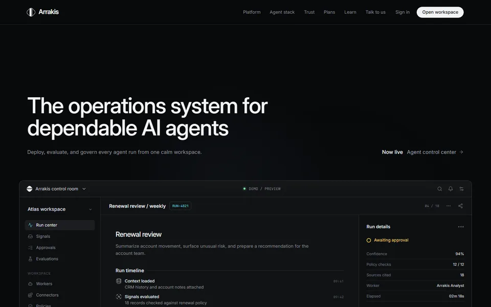
Agent Operations uses a dark, product-led composition for an AI agent platform. The page gives operational screens, evaluation states, approvals, and integrations more space than decorative art. That choice helps a technical buyer see what the product contains before reading a long claim.
The lesson is to match density to the buyer's question. A technical product can carry several information-rich panels when the page keeps headings, labels, and actions distinct.
2. Fintech Command: editorial hierarchy for a high-trust offer
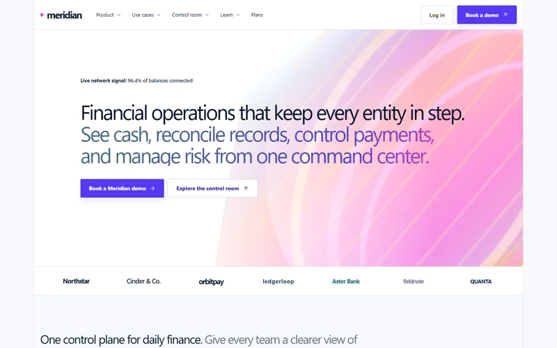
Fintech Command uses restrained color, clear financial language, and structured product panels. The composition gives cash visibility, reconciliation, controls, and infrastructure their own visual jobs instead of turning every section into the same card grid.
The lesson is that trust comes from readable decisions and credible evidence. A fintech page should reserve space for controls, data, and operating detail without inventing logos, savings, or compliance claims.
3. Pounamu Pacer: one product carries the first screen
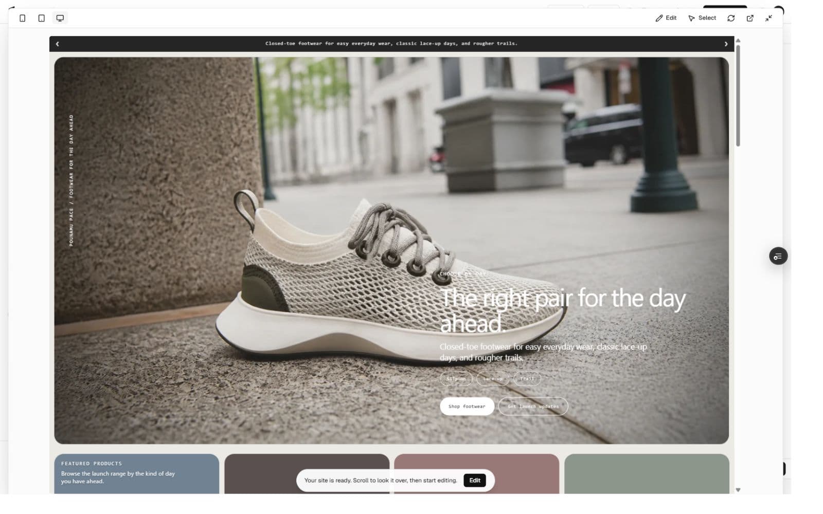
Pounamu Pacer opens with a close photograph of one shoe, a short use-case statement, and a direct shop action. The neutral palette and restrained type leave the material, lacing, and silhouette visible instead of surrounding the product with generic commerce cards.
The lesson is to make the product do the visual work. A footwear page can establish range and character through one strong object before it introduces the wider collection. The image below is the actual Iter0 builder preview from this generation run.
4. Wellness Membership: a calmer service journey
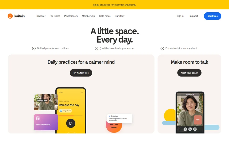
Wellness Membership uses warmer color, larger quiet areas, guided programmes, practitioner context, and a low-friction trial path. The page needs less interface density because the buyer is choosing a service relationship rather than inspecting a technical system.
The lesson is that visual tone must follow the offer. Calm spacing can support a wellness service when the programme, people, and next step remain concrete and easy to find.
How to judge an AI website example
Judge the page against its job before judging its style. Identify the intended visitor, the fact or asset that earns trust, and the action the page asks for. Then inspect whether type, spacing, imagery, and section order support those three decisions.
Check the full page at desktop and phone width. A strong first screen does not rescue clipped text, empty image slots, repeated sections, or an action that disappears on mobile.
- Visitor: name the person and the decision they are making.
- Evidence: identify what the page shows rather than merely claims.
- Action: confirm one primary next step remains visible and usable.
- Responsive design: resize the same page and inspect what changes.
Use a reference without copying its identity
A reference can supply composition, rhythm, and section treatment. It does not supply another company's name, copy, customer proof, product imagery, or legal claims. Keep the source of business facts separate from the source of visual direction.
The four examples apply that rule to different website categories. Start with the example whose page job resembles yours, then replace its subject matter with your own offer, evidence, assets, and next action.
Put the brief into practice
A launch page should make the buyer, promise, proof, and next action obvious. Iter0 uses this same standard when it turns a brief or reference site into a builder-ready page.
Start your launch build