
How to improve website UI with Claude Code: a practical design review
Review a website built with Claude Code: check loaded design instructions, trace a CSS mismatch, and compare the page on desktop and mobile.

7 min read
In this note
Find the cause before redesigning
When a website built with Claude Code looks wrong, identify one visible difference and trace it to its cause. A missing design instruction, a CSS override and a poor layout need different repairs. Asking for another redesign before finding the cause can replace parts of the page that already work.
For a designer or developer building a startup website, a useful review ends with a specific change you can inspect: the correct button colour, readable plan comparisons, or a signup form that still works on a phone.
Start with one observed problem
Choose one page and describe what the visitor cannot do comfortably. On a pricing page, that might be comparing the monthly cost and included limits. On a product page, the explanation might sit below a large image that says little about the product.
Keep the website's job in view. A pre-launch page may need to explain who the product helps and collect interest; it does not need an invented customer list or a dashboard screenshot presented as a finished product.
Give Claude a bounded brief:
TARGET: The pricing section on /pricing.
CHANGE: Keep each price beside its plan name. Make the included
limits easy to compare at 390px and 1440px viewport widths.
KEEP: Existing copy, typeface, colours and signup destination.
Before editing, identify the files responsible for this section.
Check the widths your layout needs
Those widths are example review sizes, not a promise that every device is covered. Add widths or states where your own layout changes.
Check the instructions before changing the design
If Claude keeps choosing a different font or colour, check whether it received your design rules. A file's presence in the repository does not prove that its contents entered the session.
Claude Code supports imports from CLAUDE.md. Relative import paths start from the file containing the import, not from the terminal's working directory. Imports inside Markdown backticks or fenced code blocks remain literal text. In a terminal session, /context reports loaded memory files; /memory also lists locations you can edit, including files that do not exist yet. A location in /memory is therefore not proof of loading. Claude Code memory documentation.
DESIGN.md here means your project's design note. The filename alone does not establish a particular format, an installed tool, or automatic loading.
A worked import-path check
Consider this example repository:
startup-site/
├── DESIGN.md
├── .claude/
│   └── CLAUDE.md
└── src/
    └── pricing.css
Resolve the import from its containing file
The design note is at the root, one level above .claude/CLAUDE.md. This line in .claude/CLAUDE.md points at the wrong place:
Follow @DESIGN.md for website design.Use the intended import path
It resolves to .claude/DESIGN.md. For the tree shown above, the intended line is:
Follow @../DESIGN.md for website design.Confirm the design note is loaded
Copy that line as ordinary text into the instruction file, without the surrounding code fence. If your CLAUDE.md is at the repository root instead, @DESIGN.md is appropriate there. Do not move or duplicate the design note just to make this example fit.
After changing the import, start a fresh session in the same project and inspect /context. If the parent instruction file is absent too, investigate its loading before rewriting the design note. More detailed scope and exclusion rules are in the linked memory documentation.
Finding the intended file in context answers the loading question. It does not prove that the generated CSS uses its values.
Follow a visible mismatch into the CSS
Suppose your project note says primary buttons use --brand-action, and the stylesheet contains this simplified example:
:root {
  --brand-action: #204b45;
}

.button-primary {
  background-color: var(--brand-action);
}

.pricing .button-primary {
  background-color: #6c5ce7;
}
Trace the winning CSS declaration
The pricing button is purple because the more specific selector overrides the earlier declaration. Loading DESIGN.md again does not remove that override. Adding another colour instruction does not explain why the browser chose purple.
Inspect the button in the browser's developer tools. Find the winning background-color declaration and the file that owns it. Then ask whether the exception was deliberate. A pricing promotion might have an approved accent; an accidental hard-coded value might not.
For this example, if the exception is accidental, remove only the later background-color declaration. Leave other properties in that rule intact. Inspect the computed colour again and compare the button with the rest of the page.
This is an illustrative CSS case, not a claim about a fault in your repository. Your actual cause could be an inline style, a theme class or a different token value. Use the browser's winning declaration to choose the repair.
For the wider ownership problem, see the DESIGN.md and CSS token guide. Keep the token value in its owning stylesheet rather than maintaining a competing colour list in every prompt.
Compare the rendered page at the same width
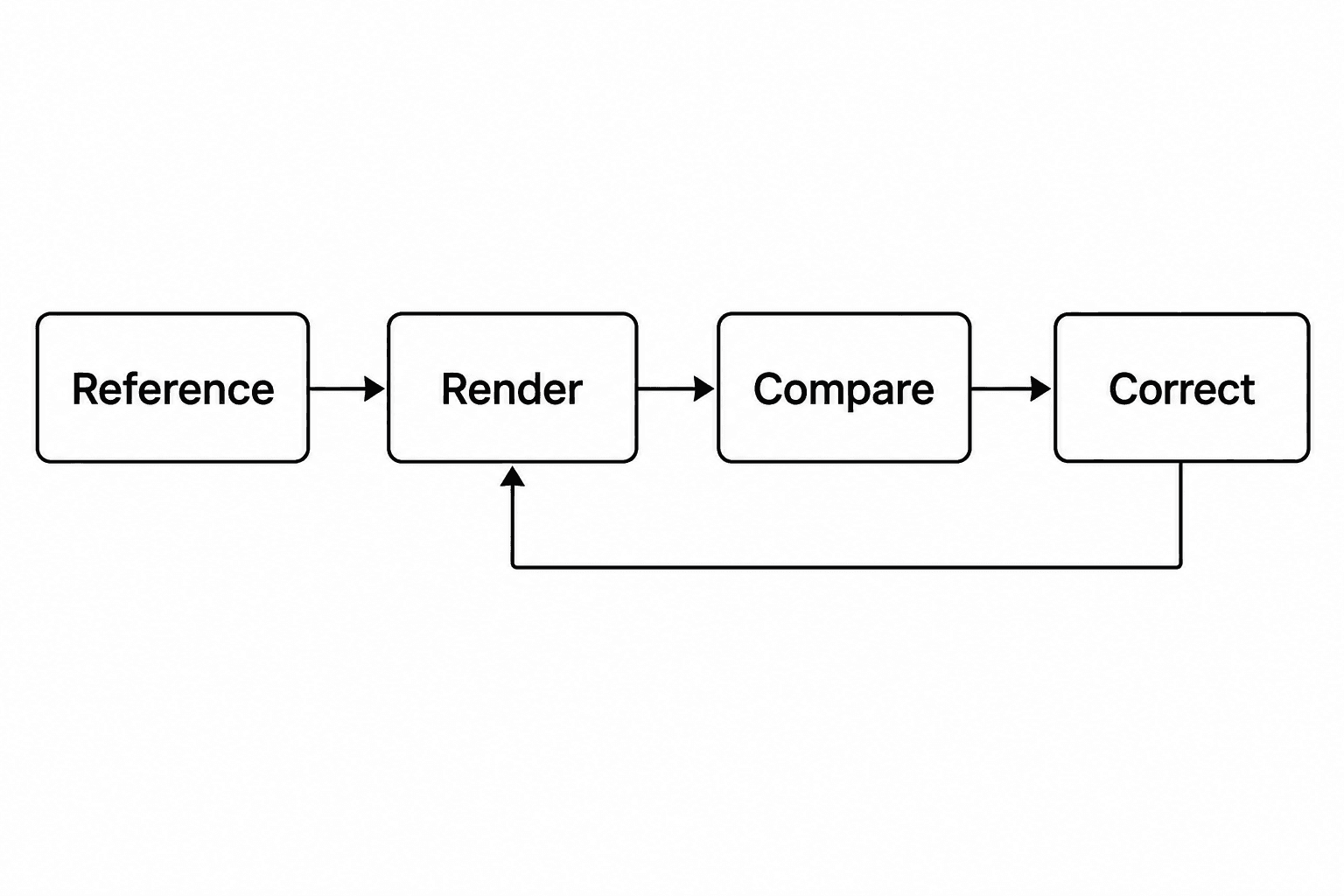
A reference is useful when you can name what it demonstrates: a readable comparison table, a clear heading, or a form whose labels remain visible. Use your own product copy and assets you have permission to use. A reference's customer evidence is not yours.
Open the current page and reference at the same viewport width. Compare the information order before the decoration. The heading can use the correct typeface and still be too small to establish the page's main point. A large illustration can be well drawn and still push the offer out of view.
Then resize the same page to your mobile review width. Check wrapping, navigation and the primary action. “No horizontal scrolling” is a useful check, but it does not show whether the visitor understands the offer or can complete the form.
Claude Code Desktop's Browser pane can run an app preview, take screenshots and inspect interactions. Availability depends on the environment and configuration. If you are reviewing from screenshots instead, say which interactions remain unchecked. Desktop preview documentation.
Ask for a repair you can accept or reject
Report the location, observed problem and intended result. Where possible, point to the evidence rather than asking Claude to choose a new visual direction:
On /pricing at 390px, the plan description separates the price
from its plan name. Keep those two items together. Preserve the
description text and the existing button treatment.
Render the same section again at 390px and 1440px.
Show the changed files and state what remains unchecked.
Inspect the changed area and its states
Check the changed area and any component it shares with other pages. A button repair can affect several routes; a change to one local pricing rule may affect only that section. Ask for that distinction before accepting the work.
Also exercise states a screenshot misses. Tab to the action and check visible focus. Open the mobile menu. Submit an empty form and read its error message. Do not send real payments or customer data just to test a visual change.
If the page matches its instructions but the result is still hard to use, the instructions may need a design decision. For example, a fixed card height might keep desktop rows aligned while clipping longer mobile copy. Change that rule deliberately and record the reason; otherwise the next session may restore it.
Keep the review usable next time
The UI review skill is a Markdown instruction set. Read it before installing it. Claude Code's project-local skill location is .claude/skills/ui-review/SKILL.md; invoke it with /ui-review and your page and reference. Skill documentation.
The skill asks for a bounded correction and a report of what remains unchecked; it is not a measured claim about model performance. If /ui-review is missing from the command menu, use the skill discovery guide; that is a different problem from a loaded skill producing an unsatisfactory design.
How this guide was prepared
This update was prepared with AI-assisted research and editing to turn the documented loading rules into a worked website review. The import tree and CSS case are illustrative, not a reported Claude Code experiment or customer result. Documentation was checked on 2 October 2026. The installed CLI reported version 2.1.283; no model session was run to validate the examples. Test the sequence in your own project before treating it as a repeatable workflow.
By John McKeown. About iter0.
Put the brief into practice
A launch page should make the buyer, promise, proof, and next action obvious. iter0 uses this same standard when it turns a brief or reference site into a builder-ready page.
Start your launch build