
DESIGN.md for Codex: keep your startup website consistent
Use DESIGN.md to keep Codex from inventing a new visual system in every session. This guide shows what belongs in the file, how to load it, and how to test it on a real startup page.

12 min read
In this note
Use DESIGN.md to stop each coding session redesigning your website
Put the design decisions Codex cannot recover from the code in one DESIGN.md file. Then point Codex to it from AGENTS.md. That is the short answer.
You need this sooner than you think. A pre-launch website can collect three button styles before it has three customers. One session improves the homepage hero. Another adds pricing. A third makes the mobile menu work. Every change looks defensible in isolation, but the website starts to feel like it was built by three different companies.
DESIGN.md gives those sessions the same brief. It should say who the website is for, what each page needs to help them decide, which parts already exist, and how you will judge the rendered result. It is useful even if your design system is nothing more than one font, six colours, a button component and a layout you want to keep.
This guide is for founders and small teams using coding agents on a live or pre-launch website. By the end, you will have a file the agent can actually use, the instruction that loads it, and a first task small enough to judge honestly.
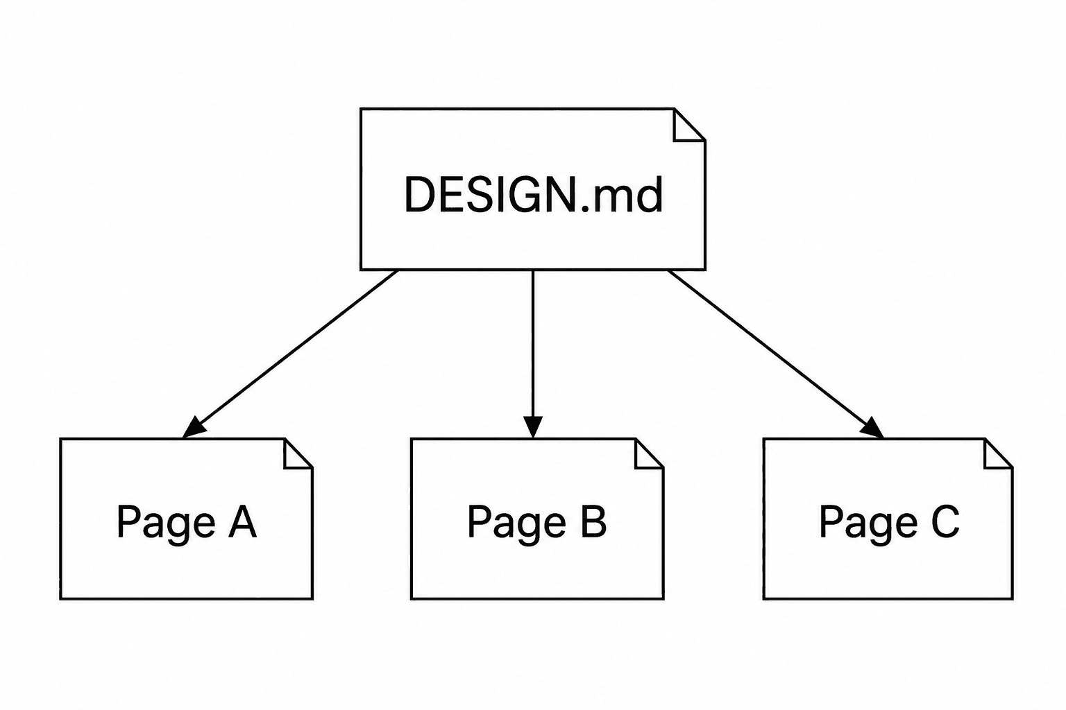
Put judgement in Markdown and mechanics in code
DESIGN.md is guidance, not enforcement. It can explain that the main call to action should be obvious without turning the page into a billboard. It cannot stop an agent from adding a seventh accent colour. Your tokens, shared components, tests and browser review do that work.
Vercel reached the same boundary while building its own public design.md workflow. A direct port of the design rules still produced inconsistent pages, so the team paired the document with a stylesheet and an evaluation loop. In its published six-page comparison, the fuller system produced 57% fewer known failures. That result is useful direction, not a law: the sample was small, the checks covered known failures, and every tested page still had at least one blocking issue.
For a startup, the split is simple. Keep exact values in code. Use DESIGN.md for the decisions behind them: what the accent colour is allowed to signal, when a compact button is appropriate, why a proof section sits before pricing, or what must happen when a form fails. Finish in the browser, because no Markdown file can see a bad line break at 390 pixels.
Inspect the website before you write the rules
Do not start with a blank document and describe the website you hope you have. Start with the repository. Find the file that loads the fonts, the CSS variables or theme tokens, the shared buttons and inputs, the layout components, the public assets, and one page you already trust.
Put those paths in DESIGN.md. “Reuse `src/components/ui/button.tsx`” settles an edit. “Keep buttons consistent” leaves the hard part to the next session. The downloadable example names `src/app/globals.css` and `src/components/ui/` because that fictional project uses those paths. Replace them with files that exist in yours.
A small startup website does not need an exhaustive inventory. Record the few things that should not drift: the loaded fonts, semantic colours, page container, spacing rhythm, shared controls, approved product images, and the route or screenshot that best represents the intended finish. If the code and the document disagree, tell the agent to report the conflict instead of quietly inventing a third answer.
- Name the actual token, component, asset and reference paths.
- State who the page is for and what they should be able to decide.
- Cover interaction states and narrow screens as well as the ideal desktop frame.
- Separate facts you can prove from claims the startup cannot support yet.
Connect DESIGN.md to Codex with one AGENTS.md rule
Codex automatically discovers AGENTS.md, not every Markdown file in your repository. A root-level DESIGN.md can sit there unread unless you load it deliberately.
Keep the detailed design reference in DESIGN.md and add the instruction below to the AGENTS.md that governs your website. A root AGENTS.md is usually enough for a small repository. In a monorepo, put the rule closer to the website if that is where the relevant instructions live. Start a fresh Codex session after changing the file, then ask Codex which instruction sources it loaded.
Do not paste the entire design reference into AGENTS.md. The pointer belongs with the operating rules; the design decisions deserve their own readable file.
## Website design work

Before changing public website UI, read DESIGN.md and inspect the code paths it names. Reuse existing tokens and components. Report conflicts before editing. After the last change, render and inspect the affected page on desktop and a narrow screen.Load the same file in Claude Code, Gemini CLI and Muse
The design decisions can stay the same when the instruction file changes. In Claude Code, add `@DESIGN.md` to the repository CLAUDE.md. Claude Code can also work with AGENTS.md, but when both files exist it reads CLAUDE.md by default, so an explicit import removes doubt.
Gemini CLI uses GEMINI.md for project context and supports `@file.md` imports. Add `@./DESIGN.md`, then run `/memory show` to check that the content is present.
Muse is used as a product name by more than one tool, and I could not find one authoritative instruction-file contract that applies to all of them. Do not assume auto-discovery. Tell the tool to read DESIGN.md and the paths inside it before editing, then ask it to summarise the constraints it will follow. If your version of Muse has its own project-instruction documentation, use that as the authority.
# CLAUDE.md
@DESIGN.md

# GEMINI.md
@./DESIGN.md

# Portable prompt for Muse or another agent
Read DESIGN.md, then inspect every code and asset path it names. Summarize the audience, page job, reusable components and verification checks before you change the website. Do not assume the file enforces itself.Write rules that settle a real edit
“Make it modern” is not a rule. Neither is “use good spacing.” Codex still has to invent the answer, and the next session may invent a different one.
Imagine a pre-launch research product called Signalnest. Its founder wants a pricing page. A useful DESIGN.md does not ask for a clean, premium feel. It says that the page is for a product lead comparing the private beta with manual interviews; the primary action is to request access; the existing button lives in `src/components/ui/`; prices are not public yet; and the product screenshot must come from the approved assets folder. Those instructions affect the page.
Cover the decisions people notice when they use it. Name the loaded fonts and sensible line lengths. Explain what background, surface, border, accent and danger colours mean, while leaving their exact values in the token file. Record the focus, loading, validation, error and success states for forms. Say what navigation does on a narrow screen. Require real product media, useful alt text and reduced motion.
Then describe the reading order. A visitor should be able to work out what the product does, whether it is for them, how it works, what evidence is real, and what happens after the main action. That is more useful than telling the agent to build another stack of rounded cards.
- Typography: roles, sizes, measure, heading order and where fonts load.
- Color and spacing: semantic tokens, grid, containers and grouping rules.
- Components: reusable paths plus default, hover, focus, loading, error, empty and success states.
- Composition: the visitor questions, evidence order and primary action.
- Responsive and access: reflow, overflow, keyboard, contrast, alt text and reduced motion.
- Assets and verification: approved locations, forbidden substitutes, viewports and checks.
Test the file on one page before you trust it
Do not ask an agent to apply DESIGN.md across the whole website. Choose one page with enough variety to expose weak instructions: a headline, a form, product media, proof and a narrow-screen layout. Ask the agent to inspect first, edit second and review the rendered page last.
The prompts below cover a new page, a review and a later update to the document. Each names what the agent must read, what it must not invent and what it needs to return.
You are looking for evidence that the file changed the work. The agent should identify the components it reused, raise conflicts, and show what happened in the browser. If it only paraphrases DESIGN.md, it has not completed the job. If it edits before opening the named files, fix that workflow before you give it more pages.
NEW PAGE
Read AGENTS.md and DESIGN.md. Inspect the token, component and asset paths they name. Build the private-beta landing page for the audience and page job in DESIGN.md. Reuse existing components and do not invent proof, customers or integrations. Render the same page at 1440x900 and 390x844, fix material issues, then report the changed files and checks.

REVIEW
Read DESIGN.md and review the current homepage against it. Do not edit yet. Rank only observable problems that affect the reader, responsive behavior, accessibility or consistency. Cite the owning code path for each problem and recommend the smallest mechanism-level fix.

MAINTAIN
We corrected this repeated design problem: describe the correction here. Inspect the owning token or component first. Update DESIGN.md only if the design decision changed or a missing rule caused the repetition. Keep implementation values in code and show the exact rule you added, changed or removed.
Fix the document when the same correction repeats
A polished document can still be useless. The usual warning sign is that it describes taste but never names the product, audience or code. Replace “premium and advanced” with a decision such as “lead with the interview-search job and use one real product screenshot.”
Keep DESIGN.md out of jobs better handled elsewhere. It should not become a second stylesheet full of copied token values. It should not make up customer numbers, testimonials, integrations or security claims. It should not claim a browser review happened when the agent only read source code.
Update the file when a design decision changes or the same correction keeps returning. If three sessions add oversized hero copy, the typography or page-arrangement rule is probably missing. If one comparison table needs a compact exception, record the exception instead of changing the whole site. If agents keep making new buttons, point more clearly to the shared component.
Remove instructions that no longer match the website. Length is not control. A good reference shortens the path between your intent, the code that owns the decision and the browser check that proves it.
- Vague taste words with no visible decision or example.
- Token values duplicated in Markdown with no code owner.
- No setup showing how the chosen agent reads the file.
- Desktop-only rules and ideal states with no failure behavior.
- A long forbidden-style list with no audience, page job or evidence order.
- A source review presented as if it were a browser review.
Use the complete startup website template
The example below is complete and fictional. Signalnest is a pre-launch customer-research product, not an iter0 customer or a claim about a real company. The file covers evidence limits, code paths, component states, composition, responsive behaviour, accessibility, motion, assets, the agent workflow and the final checks.
Copy it into your repository as DESIGN.md. Replace Signalnest, its audience, its claims and every path with facts from your project. Delete sections that do not affect your website. Add a rule when it settles a real choice or prevents a mistake you have seen more than once. The download contains the same raw Markdown shown here.
---
name: signalnest-startup-website-design
description: "Design, build or substantially improve the public website for Signalnest, a fictional pre-launch customer-research startup. Use this reference for positioning, information architecture, visual hierarchy, responsive behavior, components, conversion paths and browser verification."
---

# Design the Signalnest website as one clear argument

Act as a strong product designer, editor and frontend engineer. Turn the
available product facts into a website a busy startup founder can understand,
trust and act on. Shape the message and interface together. Do not simply apply
styles to supplied copy or assemble familiar landing-page sections.

This is a complete example for a fictional company. Replace its product facts,
audience, proof, tokens, assets and code paths with verified facts from the
project you are working in.

This file provides design judgement. It does not enforce the result. The code,
shared components, automated checks and rendered browser review provide the
mechanical safeguards. A completed implementation is not accepted until the
actual page has been inspected at the required viewports.

## Product and audience

Signalnest helps small product teams turn customer interviews into a searchable
evidence library.

- Primary visitor: a founder or product lead at a software startup with fewer
  than 20 people.
- Situation: useful interview notes are spread across documents, recordings and
  chat threads. The team cannot quickly recover the evidence behind a decision.
- Primary job: decide whether Signalnest could make customer evidence easier to
  find and reuse.
- Primary action: join the private beta.
- Secondary action: view a two-minute product walkthrough.
- Available proof: five approved design-partner quotes, one working transcript
  search demo and the founder's product-research background.
- Product state: private beta. Do not imply general availability.
- Voice: direct, calm, specific and technically literate. Explain the customer's
  job before explaining the technology.
- Never invent customer counts, time savings, integrations, security claims,
  funding, awards, availability dates or testimonials.

The visitor should leave knowing what Signalnest does, whether it is for a team
like theirs, what the product looks like, what evidence is real, and what will
happen after they join the beta.

## Use this priority order

When instructions compete, protect them in this order:

1. Preserve verified product facts, evidence limits, legal language, privacy
   requirements and the requested scope.
2. Preserve the host project's framework, routes, design tokens, shared
   components, accessibility conventions and build system.
3. Make the visitor's problem, Signalnest's answer and the next action clear in
   the first reading path.
4. Make claims earn trust through real product evidence and qualified language.
5. Establish a recognisable Signalnest expression through typography, rhythm,
   composition and product media.
6. Refine responsive behavior, interaction and detail without weakening the
   message or hiding content.

If a visual preference conflicts with truth, accessibility or a working
component contract, the preference loses. If a requested layout would bury the
primary action or force unsupported claims, explain the conflict and propose a
safer composition.

Ask one grouped set of questions only when an unknown could change the product
claim, target audience, price, legal meaning, data handling, customer identity,
approval status or destination of the primary action. Otherwise omit the
unknown, label the limit honestly and continue.

## Integrate with the existing project

Preserve the repository's architecture. Edit the files that already own the
surface. Do not introduce a new UI framework, token layer, component library,
icon set or font package to solve a page-level task.

Read these files before changing the public interface:

- Global tokens and base styles: `src/app/globals.css`
- Font loading and shared metadata: `src/app/layout.tsx`
- Shared controls: `src/components/ui/`
- Marketing sections: `src/components/marketing/`
- Public images and logos: `public/brand/`
- Product screenshots: `public/product/`
- Approved homepage reference: `docs/design/homepage-approved.png`
- Product facts and approved claims: `docs/product/website-facts.md`

Verify every path exists. If the repository uses different paths, update this
file before applying it. Do not create empty files to make an example path true.

The code owns exact token values and component behavior. This file explains how
to apply them. If a value in this file differs from the code, report the
conflict. Do not silently add a third value.

Reuse the current implementation in this order:

1. Existing semantic component with the required behavior.
2. Existing primitive composed for the new page.
3. A small extension to an existing component when the new state is shared.
4. A page-owned component when the behavior is genuinely local.

Keep the page server-rendered unless an interaction needs client state. A
static headline, proof section or pricing explanation does not need a client
component. Add dependencies only when the requested behavior cannot be built
reliably with the installed stack.

## Work in five passes

### Frame the visitor's decision

Inspect all available product material before designing. Privately answer:

- Who opens this page, and what are they trying to decide?
- What current pain makes the decision relevant now?
- What is the strongest supported answer Signalnest can give?
- What product evidence earns that answer?
- What limit or uncertainty changes how the answer should be interpreted?
- What is the smallest useful next action?

Separate facts, inferences, plans and recommendations. A working transcript
search is a fact. A claim that it will save every team ten hours a week is not a
fact without evidence. A planned integration is not an available integration.

Order the page around the visitor's questions, not the order of a pitch deck or
the sequence in which source notes were supplied. Support two reading speeds:

- Fast path: title, headings, product image, proof captions and calls to action
  communicate the argument in under a minute.
- Careful path: body copy, product details, beta limits, privacy notes and
  source links let a serious visitor assess the claim.

Write for the least technical named buyer while keeping exact product terms
where precision matters. Define an unfamiliar term once. Do not expose internal
authoring language such as hierarchy, conversion architecture or evidence map
in customer-facing copy.

### Build the evidence map

Before choosing sections, list each material claim and its evidence. Give every
claim one primary home on the page.

For each claim record:

- Exact approved wording or the narrowest accurate paraphrase.
- Evidence type: live product behavior, screenshot, quote, founder experience,
  policy, price or beta condition.
- Source file or approved URL.
- Relevant date, product version and qualification.
- Whether the evidence can appear publicly.

Use the strongest evidence closest to the claim it supports. A real search
result belongs near the explanation of search, not in an unrelated gallery at
the bottom. A quote about decision confidence belongs near the workflow it
describes.

Do not repeat the same claim as a hero statement, three feature cards, a quote
heading and a closing summary. Repetition does not create proof. Use the saved
space to answer the next visitor question.

When proof is thin, narrow the claim. Do not compensate with logos, large type,
decorative statistics or assertive adjectives. An honest private-beta page can
be persuasive because it shows a specific problem, a real product and a clear
way to participate.

### Choose the composition

Name the obvious generated landing-page layout before coding. It is usually a
centered hero, logo strip, three equal feature cards, alternating image rows,
testimonial cards and a large final call to action. Reject that structure unless
the material independently earns every part.

Compare two materially different compositions when the source supports them.
For example:

- Product-first: a concise promise beside a real searchable transcript, then
  the workflow, evidence and beta invitation.
- Problem-first: a trail from scattered notes to one recovered decision, then
  product proof, fit and beta invitation.

Choose the version that answers the visitor's decision with the least
explanation. Change topology and evidence placement, not only colors or card
styles.

The first viewport is the argument. It must contain identity, a plain-language
answer, enough context to understand the answer, a real piece of product
evidence and one primary action. If the visitor saw only that viewport, they
should remember the product's job, not a visual effect or generic AI claim.

Give each later section a new reader question. Vary the geometry when the
material changes:

- A sequence for the interview-to-decision workflow.
- An annotated screenshot for product behavior.
- Aligned quote rows for evidence from peers.
- A simple boundary list for who the beta is and is not for.
- A short expectation block beside the beta form.

Use a table only when precise row-by-row lookup matters. Use prose for one
conclusion. Use a diagram only when relationships become faster to understand
visually. Do not draw a chart because numbers exist.

Run a squint check before implementation. One focal relationship should be
obvious in each major section. If every block has equal weight, the composition
has not made a decision.

### Implement the system

Build structure before decoration. Establish semantic landmarks, source order,
heading order, containers, grids and responsive reflow. Then apply typography,
color, components, media and restrained interaction.

Use page-owned CSS only for the page-specific composition. Shared type, color,
spacing, radii, focus and control behavior belong to existing tokens and
components. Do not target internal selectors of a shared component to force a
local appearance. Extend its public API or choose a different composition.

Give every gap one owner. A stack, grid or section sets the spacing between its
children. The children do not each add unrelated margins. Use small gaps within
one idea, medium gaps between groups and large gaps only for a real chapter
change.

Implement all meaningful states in the same pass. A beta form includes default,
focus, typing, validation, submitting, failure and success. A mobile menu
includes open, close, Escape, outside action, focus return and current-page
state. A screenshot includes dimensions, caption and alt treatment.

Do not add motion, decoration or a new component until the static reading path
works at desktop and narrow widths.

### Inspect and revise privately

Render the actual page with realistic content. Inspect the first viewport, the
full page and every changed state at 1440 by 900 and 390 by 844. Also check 320px
width for overflow. Use the same page and content when comparing viewports.

Review in this order:

1. Truth: Are every visible claim, quote, label and destination supported?
2. First read: Can the intended visitor say what the product does and what to do
   next after scanning the first screen?
3. Composition: Does each section answer a new question? Is one object clearly
   dominant where emphasis is needed?
4. Language: Are headings concrete, copy direct and qualifications intact?
5. Typography: Are roles consistent, line lengths readable and important line
   breaks deliberate?
6. Layout: Do objects align to shared edges? Are gutters clear? Is empty space
   purposeful rather than caused by an underfilled grid?
7. Components: Do all states use the shared system and remain understandable?
8. Responsive behavior: Does the page recompose without hiding evidence,
   shrinking controls or creating horizontal page scroll?
9. Accessibility: Are semantics, keyboard order, focus, labels, errors,
   contrast, alternatives and reduced motion sound?
10. Restraint: Can a surface, border, icon, label, paragraph or effect be removed
    without losing meaning or function? If yes, remove it.

Fix the highest-impact systemic issue, render again and repeat. Keep this
critique private unless the user asks for it. Deliver the implementation and a
short account of evidence, not an internal scorecard.

## Startup website design authority

### Information architecture

The default public navigation contains Product, How it works, Pricing and About.
Include a page only when it has useful content. Do not publish empty category
pages to make the navigation look established.

The header primary action is “Join the private beta.” The footer may include
privacy, terms, contact and a short product description. Do not repeat the full
navigation, mission statement and signup pitch in every footer column.

One page owns one primary intent. A homepage may orient and route. A pricing page
explains cost and boundaries. An about page establishes who is building the
product and why their experience is relevant. Do not make every page a full
sales funnel.

### Typography

- Use Inter for product and marketing text. It is loaded in
  `src/app/layout.tsx` as `--font-sans`.
- Use JetBrains Mono only for transcript excerpts, timestamps and short
  identifiers. It is loaded as `--font-mono`.
- Use type tokens in `src/app/globals.css`. Do not add arbitrary pixel sizes to
  page components.
- The page title is `text-5xl` on desktop and `text-4xl` on narrow screens. It
  should normally fit in 12 words or fewer.
- Major section headings are `text-3xl` on desktop and `text-2xl` on narrow
  screens.
- Body and control text is at least 16px. Supporting metadata may use 14px when
  contrast and line height remain readable.
- Reading copy stays between 55 and 70 characters per line.
- Use one H1, then ordered H2 and H3 headings.
- Use sentence case. Avoid all-caps labels, tracked eyebrows and decorative
  section numbers.
- Rewrite before shrinking. Do not reduce one heading because its wording is
  longer than a peer.

Prefer “Find the interview behind the decision” to “Unlock customer
intelligence.” Prefer “Search every approved transcript” to “One source of
truth.” Concrete language helps both the visitor and the coding agent.

### Color

Use semantic variables in `src/app/globals.css`:

- `--background`: page canvas, `#f7f6f2`
- `--foreground`: primary text, `#17201c`
- `--surface`: interactive and evidence surfaces, `#ffffff`
- `--muted`: subordinate surface, `#eeece5`
- `--muted-foreground`: secondary text, `#59615d`
- `--border`: dividers and control boundaries, `#d8d6cf`
- `--accent`: primary action and selected state, `#136c55`
- `--accent-foreground`: text on the accent, `#ffffff`
- `--danger`: destructive or failed state, `#b42318`

Do not use raw hex values in components. Do not create a new green for one
section. Use color for action, status or data meaning. Pair every status color
with text, icon shape or another non-color cue. Meet WCAG AA contrast in default,
hover, focus, disabled and error states.

The page is one continuous canvas by default. A surface must communicate a real
group, selection, interaction, comparison or change in tone. Do not put every
paragraph, feature or metric in a bordered card.

### Spacing and grid

- Use the spacing scale in `src/app/globals.css`: 4, 8, 12, 16, 24, 32, 48, 64
  and 96px.
- Main width: `max-w-6xl`, with 24px side padding on desktop and 16px on narrow
  screens.
- Reading width: `max-w-2xl`.
- Desktop: 12 columns with 24px gutters.
- Tablet: 6 columns with 20px gutters.
- Mobile: 4 columns with 16px gutters.
- Align titles, copy, screenshots, forms and proof to shared grid lines.
- Give wide evidence enough width. Do not compress a product screenshot or
  comparison beside a prose rail merely to fill a two-column pattern.
- Three true peers may share a row. Unequal ideas should not be forced into equal
  cards.

Open space amplifies the focal object. Large accidental gaps caused by an orphan
card, a short left column or delayed proof are layout defects. Reflow or stack
the content instead of filling the gap with decoration.

### Components and states

Reuse `src/components/ui/` and preserve its public properties.

Buttons:

- Primary: filled accent treatment, used once in a decision area.
- Secondary: transparent or surface treatment with a visible boundary.
- Text link: descriptive link text, visible focus and underline on hover and
  focus.
- Required states: default, hover, focus-visible, active, disabled and loading.
- Loading keeps width stable and updates the accessible label.
- Button text describes the result: “Join the private beta,” not “Get started.”

Forms:

- Every field has a visible label. Placeholder text is an example, not a label.
- Optional and required status is clear before submission.
- Help text occupies stable space when an error may replace or follow it.
- Errors say what happened and how to fix it.
- Preserve valid input after a failed submission.
- On success, replace the form with confirmation, the expected response time
  and the next useful action.
- Do not request information that is not needed to qualify or contact the beta
  participant.

Navigation:

- The mobile menu uses a labelled native button.
- It closes with Escape and returns focus to the opening button.
- It does not trap focus unless it behaves as a modal.
- Current-page state is visual and programmatic.
- The header remains usable at 200 percent zoom.

Disclosures and tabs:

- Use native disclosure elements for optional detail when possible.
- Tabs are for peer views of one subject, not for hiding unrelated sections.
- Keyboard behavior follows the selected interaction pattern.
- Essential product explanation remains available without hover.

### Composition

The homepage answers these questions in order:

1. What job does Signalnest help me do?
2. Is it built for a team like mine?
3. What happens inside the product?
4. What real evidence should I trust?
5. What are the limits of the current beta?
6. What happens after I join?

The opening contains the Signalnest name, one plain-language promise, a short
orientation, the primary action and a real product view. Do not lead with an
abstract illustration, a product category or the phrase “AI-powered.”

Use one evidence-bearing organising move that belongs to this product. A strong
option is a visible chain from a transcript sentence to a tagged insight and
then to the decision it informed. This explains the product more effectively
than a row of generic feature icons.

Do not repeat identical section silhouettes. A workflow sequence, annotated
product view, quote row and beta boundary list should not all look like three
rounded cards.

### Evidence, testimonials and claims

- Use only approved quotes with exact wording, person, role and company display
  permission.
- Keep a quote near the product behavior it supports.
- Do not turn a design partner into a paying customer through ambiguous labels.
- Do not use an employer logo to imply endorsement.
- If a result is anecdotal, present it as an experience, not a general outcome.
- If a number lacks a clear population, period and source, omit it.
- Link privacy and security statements to the current policy or technical fact.
- Show beta limits plainly. Honest scope is a trust signal.

### Pricing and beta expectations

If pricing is not approved, do not invent a plan grid. Explain that pricing is
being tested with beta partners and state what participation requires. If
pricing is approved, show the billing period, currency, included usage, limits,
tax treatment and cancellation terms near the amount.

The beta signup area states:

- Who the beta is designed for.
- What information is requested and why.
- Whether access is immediate or reviewed.
- Expected response time if it is supported.
- What data the product will need during the beta.
- A link to privacy information.

Do not add a countdown, false capacity warning or manufactured urgency.

### Product media and assets

- Wordmark: `public/brand/signalnest-wordmark.svg`
- Mark: `public/brand/signalnest-mark.svg`
- Product screenshots: `public/product/`
- Approved customer assets: `public/customers/approved/`

Use the wordmark where identity must be explicit. Use the mark only when the
name is already visible or available to assistive technology.

Product screenshots show the real interface and a state a beta visitor could
encounter. Include empty, loading, no-results or error states when they matter
to the explanation. Do not build a fake dashboard for decoration.

Include the capture date in screenshot filenames. Remove personal data. Set
intrinsic dimensions to prevent layout shift. Use SVG for simple marks, AVIF or
WebP for photography and PNG when small text in a screenshot needs lossless
detail.

Crop only when the crop preserves the behavior named in the caption. Captions
state what the visitor should notice and any limit that affects interpretation.
Decorative images use empty alt text. Informative images explain their useful
content, not their appearance.

Do not use stock photos, generated abstract art, fake testimonials, invented
customer logos or decorative AI imagery.

### Responsive behavior

- Preserve the same meaning and evidence at every viewport.
- Below 900px, collapse navigation into the documented mobile control.
- At 768px and below, stack split layouts and place media after the copy it
  explains unless the source order requires otherwise.
- Keep the primary action visible without sticky obstruction.
- Product media keeps its natural aspect ratio.
- Ordinary page content never scrolls horizontally.
- A genuinely wide comparison may scroll inside a labelled region after column
  reduction and stacking have been considered.
- Test a long heading, long customer name, validation error and 200 percent
  zoom. Do not design only for ideal-length copy.
- At 320px width, controls remain usable and no word wraps character by
  character because of a narrow grid track.

Responsive work is recomposition, not shrinking. Move supporting proof below
the claim, stack controls, simplify secondary metadata and preserve the reading
order. Do not hide a substantive section on mobile to make the screenshot neat.

### Accessibility

- Use header, nav, main, section, aside and footer landmarks where they match
  the content.
- Provide one H1 and ordered headings.
- Include a skip link.
- Prefer native elements before ARIA.
- Give every control an accessible name and visible focus.
- Associate field help and errors with the owning input.
- Announce asynchronous submission status without moving focus unexpectedly.
- Keep touch targets at least 44 by 44px where space permits.
- Meet WCAG AA contrast and never rely on color alone.
- Preserve reading and keyboard order when the visual layout changes.
- Verify at 200 percent zoom and with a screen reader for new interaction.

### Motion

Default to stillness. Motion may explain a state change, preserve spatial
context or confirm an action. It may not gate reading or compensate for weak
hierarchy.

- Interface transitions: 120 to 220ms.
- Respect `prefers-reduced-motion: reduce` and remove non-essential movement.
- No auto-playing carousel, parallax, simulated typing, bouncing indicator,
  continuous marquee or scroll-triggered reveal for ordinary content.
- Loading motion includes a text label.
- Hover movement does not shift surrounding layout.
- The complete reading path works with animation disabled.

### Do and do not

Do:

- Lead with the customer's job and show the real product early.
- Use approved facts, qualified evidence and clear beta limits.
- Reuse semantic tokens and components already in the repository.
- Make one action dominant in each decision area.
- Let different material use different geometry.
- Put exceptions beside the rule they change.
- Render after the final edit and report missing verification honestly.

Do not:

- Use stock hype or an unsupported superlative.
- Duplicate token values inside page files.
- Add an interface library for one marketing page.
- Turn every section into a card grid.
- Hide important information in animation, hover or a carousel.
- Invent proof to fill a sparse page.
- Treat this document as evidence that the rendered page follows it.

## Reject generated-design reflexes

Do not ship these familiar defaults:

- A centered headline above two buttons and a decorative gradient product mock.
- An all-caps eyebrow above every heading.
- Three equal feature cards when the ideas are not equal.
- A pill for ordinary labels, dates, categories or metadata.
- Gradient text, glowing blobs, glass panels, grid backgrounds or ornamental
  shadows.
- Large rounded containers around every screenshot, form and quote.
- Icons inside colored tiles when text would be clearer.
- Tiny gray copy used to force content into a preferred layout.
- A logo cloud that implies relationships the company cannot substantiate.
- Invented metrics shown in large numerals.
- Repeated summary, benefits and conclusion sections saying the same thing.
- A dark call-to-action band added only because the page needs an ending.
- Visible process narration about how the page was designed.
- Stock imagery of people looking at laptops.
- A desktop composition simply scaled down for mobile.
- A visual review claim based only on reading source code.

Avoiding these patterns does not mean producing a plain, lifeless document.
Create presence through a specific product demonstration, disciplined type,
clear contrast, deliberate pacing and one strong relationship per section.

## Agent workflow

Before editing:

1. Read this file and the active project instruction file.
2. Inspect every token, component, asset, fact and reference path named here.
3. State the visitor, decision, strongest supported answer and primary action.
4. List the components and tokens you will reuse.
5. Identify conflicts or missing facts that could change the public claim.

While editing:

1. Change the smallest set of files that owns the result.
2. Preserve approved copy and evidence unless the task asks to change them.
3. Use semantic tokens and public component APIs.
4. Implement meaningful states and narrow-screen behavior with the main change.
5. Keep the page complete without animation.
6. Do not add claims, assets, dependencies or routes outside the request.

After editing:

1. Run lint, type checks and relevant tests.
2. Render the changed page with realistic content.
3. Inspect desktop, narrow mobile and 320px overflow.
4. Exercise every changed interaction and destination.
5. Fix material defects, then repeat the checks.
6. Report changed files, decisive evidence and any verification that could not
   run.

## Verification contract

The work is not visually accepted until all applicable checks below pass after
the last edit.

Content and trust:

- The H1 states a clear product job without hype.
- Product state and beta limits are accurate.
- Every quote, logo, number and security statement has approved evidence.
- The primary action has a real destination and clear next-step expectation.
- No placeholder, invented customer or unsupported integration remains.

Desktop at 1440 by 900:

- The first viewport contains identity, answer, context, product evidence and
  primary action.
- One object is dominant; supporting copy and actions are visibly subordinate.
- Reading copy stays within its measure.
- Screenshots and evidence have enough width to be understood.
- Shared edges, gutters and section transitions are deliberate.

Mobile at 390 by 844 and overflow check at 320px:

- Source order remains logical.
- Navigation opens, closes, handles Escape and restores focus.
- Split layouts stack without stranded labels or oversized gaps.
- No ordinary page content scrolls horizontally.
- Controls remain readable and tappable.
- The primary action is not hidden by sticky interface.
- Images preserve the evidence named in their captions.

Interaction and access:

- Keyboard order follows reading order.
- Focus is visible on every interactive element.
- Labels, help, errors and status are programmatically associated.
- Loading, failure, empty and success states are understandable.
- Text and state contrast meet WCAG AA.
- Informative images have useful alternatives; decorative images are silent.
- The page works at 200 percent zoom.
- Reduced-motion preference removes non-essential movement.

Technical:

- The repository's lint, type and relevant tests pass.
- There are no console errors caused by the change.
- Internal links and the beta destination return the intended page.
- Image dimensions prevent avoidable layout shift.
- Metadata, canonical URL and structured data describe this page accurately.
- The raw downloadable Design.md, if published, returns Markdown content and is
  linked with descriptive text.

Compare the implementation with `docs/design/homepage-approved.png` only where
that reference applies. Use the same viewport and content. A differently sized
page is not valid visual comparison evidence.

If browser access, a real destination, approved evidence or a required test is
missing, state the limit. Do not describe the website as verified, accessible,
on-brand or ready to publish based on source inspection alone.

When a repeated defect appears across pages, fix the token or shared component
that owns it. Update this file when the design decision changes or a missing
decision caused the repetition. Remove obsolete rules so the reference remains
coherent.
Judge the rendered page, not the agent's summary
The final question is not whether Codex says it followed DESIGN.md. It is whether the intended visitor can understand the product and take the next step without losing trust. Run the relevant code checks, then inspect the page after the last edit.
Use realistic copy at a desktop viewport and a narrow viewport. Read the first screen, then the whole page. Tab through every changed control. Trigger form errors, loading and success. Check heading order, focus, contrast, alt text, overflow and reduced motion. Follow the main link to its destination. If a check cannot run, state the limit instead of calling the page verified.
Google's people-first guidance asks whether someone leaves feeling they learned enough to achieve their goal. That is the right closing test here. You should now be able to create DESIGN.md, connect it to your coding agent, give it one bounded page, and judge the result yourself.
Put the brief into practice
A launch page should make the buyer, promise, proof, and next action obvious. iter0 uses this same standard when it turns a brief or reference site into a builder-ready page.
Start your launch build