
A Codex responsive-design skill for reviewing mobile layouts
Review the same website at wide and narrow widths, locate layout failures, and give Codex bounded corrections. Includes a Markdown skill.
5 min read
In this note
Review the page, then correct the rule
Keep the content and page state the same
Check what the visitor needs first
Find the layout constraint behind overflow
Review the page, then correct the rule
Give Codex a responsive-design review with a specific page, its intended purpose and evidence from the browser. Ask it to inspect the same page at different widths, identify the rule behind a visible problem and correct that rule without replacing the design.
This is useful when a desktop page looks finished but its mobile version loses the order of information. A heading may wrap awkwardly, a navigation menu may hide the main action, or a row of cards may become a long column of repeated text. Each needs a different correction.
The downloadable skill turns this review into a repeatable procedure. It is an instruction set to adapt to your project, not a claim that it improves every model or has been benchmarked across agents.
Keep the content and page state the same
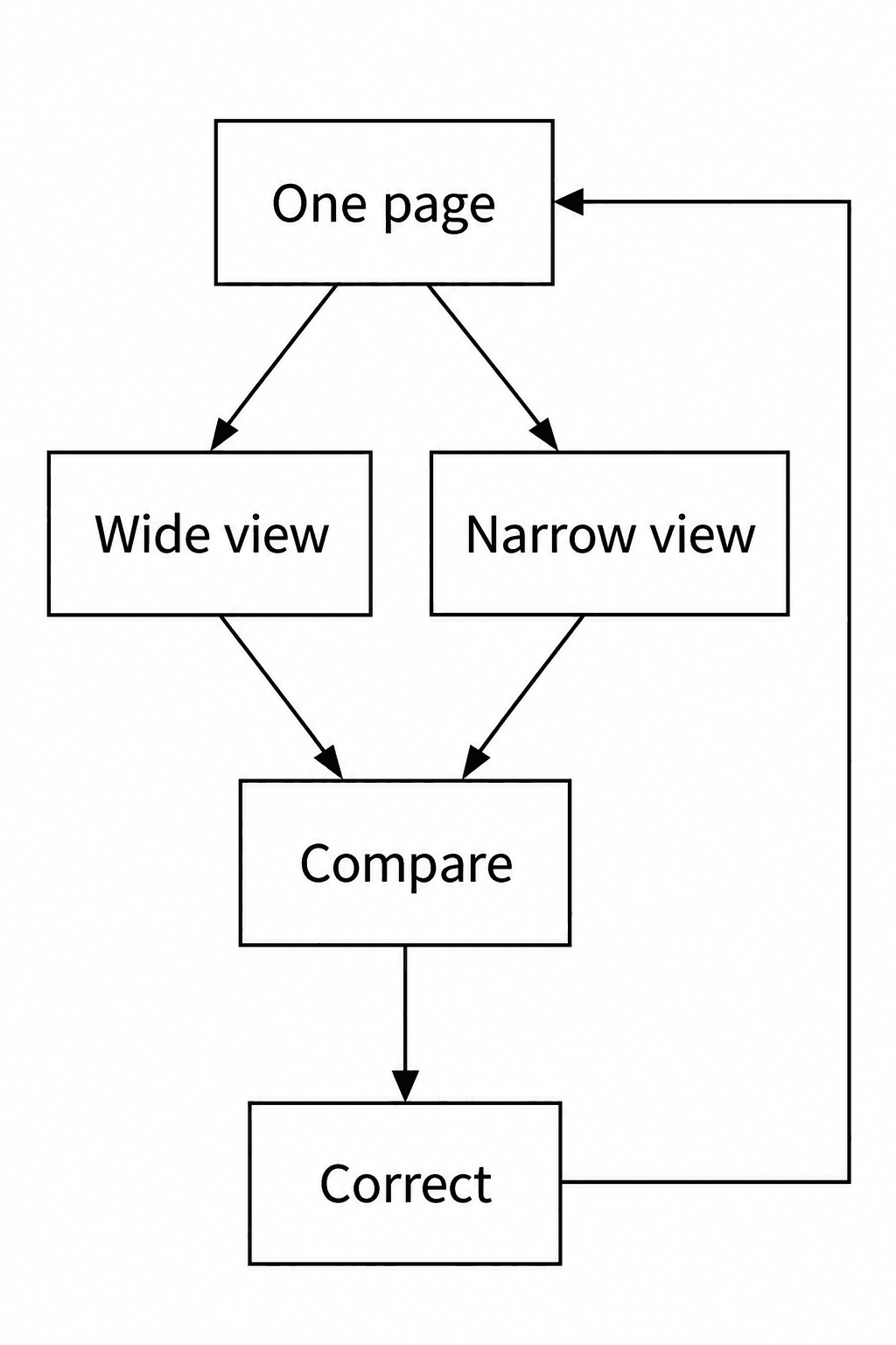
Compare one page with itself before you compare two designs. Keep the content, selected tab, open menu and form state consistent while changing the viewport. Otherwise, a difference in the data can look like a difference in the layout.
Begin with the desktop width the page was designed for. Then resize the same browser page to a narrow viewport. A width of 390 pixels is a useful test case, not a definition of mobile compatibility. Inspect nearby widths and the places where the layout changes.
If a card row changes to a column at a breakpoint, check just above and below that point. The narrowest supported screen matters, but an intermediate width can also expose a cramped heading or a control with too little room.
Check what the visitor needs first
A page can fit inside the screen and still be difficult to use. A pricing page may put the price below several paragraphs. A menu may occupy most of the first screen. A signup form may separate a label from the field it explains.
Name the visitor's main task before reporting these problems. This gives the review a basis beyond personal preference. On a pricing page, the question may be whether the reader can compare plans. On a product page, it may be whether the offer and next action are clear.
Preserve those relationships when the layout changes. The desktop arrangement does not have to survive literally. The connection between a heading and its explanation, or a field and its error message, does.
Find the layout constraint behind overflow
When something extends beyond the page, ask Codex to identify the element and the constraint producing the width. Do not begin by hiding the overflow on the whole document. That can conceal content without making the layout work.
Useful things to inspect include fixed widths, minimum widths, long unbroken text, images and grid or flex children. A local code block or wide data table may need its own scrolling region. That is a different case from making the entire page scroll sideways.
Responsive design can combine fluid sizing with layout changes at suitable widths. MDN explains how flexible layouts and media queries work together. Use that documentation to choose a correction that fits the existing layout, rather than adding a separate rule for every device name.
Write a correction with a clear boundary
Tell Codex where the problem appears, what you observed and what must remain intact. The instruction below gives the agent room to investigate while limiting the change.
After the correction, inspect the wide view too. A rule that fixes one width can change another. Keep the existing copy and visual system unless they are part of the requested repair. If the content itself prevents a useful layout, report that issue instead of silently rewriting it.
Review the pricing page at 1440px and 390px.
The plan names wrap into the prices at the narrow width.
Find the layout rule responsible and correct it.
Preserve plan copy, colors, typefaces and button behavior.
Render both widths again and inspect the result.
Check navigation and interaction states
Open the mobile navigation and try the primary action. Review focus, validation errors and expanded controls where they apply. A closed menu screenshot says little about whether someone can use the menu.
Browser resizing is only part of the check. It does not establish how the page behaves with every touch interaction, virtual keyboard or device browser. State those limits when the test environment cannot cover them.
Also check the viewport configuration if the layout behaves as though the mobile screen were much wider than it is. MDN documents how viewport metadata affects the layout width used by mobile browsers. Do not disable user zoom as a way to make a layout seem stable.
Use the skill with a real browser
Save the download as SKILL.md inside a folder named responsive-review. Use the skill installation method supported by your Codex environment. The file requests a page URL, a defined purpose and access to current rendered output. Read and adapt its boundaries before use.
If browser access is missing, the skill permits a limited source review but requires the result to say that visual behavior remains unverified. It does not treat a passing build as proof of a responsive page.
Iter0's design standard is fidelity to the intended website across screen sizes. A responsive review makes that standard specific: preserve the meaning and visual relationships, correct the constraints that fail, and inspect what the visitor will actually receive.
Put the brief into practice
A launch page should make the buyer, promise, proof, and next action obvious. Iter0 uses this same standard when it turns a brief or reference site into a builder-ready page.
Start your launch build