What makes a good developer tool landing page?+
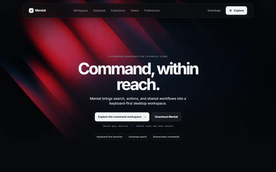
Developers usually want to see the interface and try it quickly. Show the product on the first screen, then walk through a few tasks, such as opening a file or running a saved command, with the keystrokes visible. List supported operating systems next to the install button, so a visitor on an unsupported system knows before downloading. This template follows that order: interface hero, feature walkthrough, then shortcut cards.
Can I use this template for a desktop or productivity app?+
Yes. It suits desktop utilities, launchers, AI assistants and workflow tools where speed and keyboard use are part of the appeal. Replace the command hero with your own interface, adjust the shortcut cards to your real commands and state which operating systems you support. If your product is web-only, change the explore call to action to a sign-up rather than a download.
How much text should a productivity software homepage have?+
Usually one or two sentences per feature, placed beside the screenshot or short recording that shows it. Productivity buyers often judge the product by its interface, so the image carries most of the explanation and the sentence tells the visitor what they are looking at, such as 'Search every open project from one command bar.' The builder writes a first draft from your brief, and you can shorten it in the editor.